 ice's blog
CSS - Grid 布局
基本概念
传统布局方式
利用
position属性 +display属性 +float属性布局,兼容性最好,但是效率低,麻烦!Flex 布局
有自己的一套属性,效率高,学习成本低,兼容性强!
Grid 布局
网格布局(Grid )是最强大的 CSS 布局方案。但是知识点较多,学习成本相对困难些,目前的兼容性不如 Flex 好!
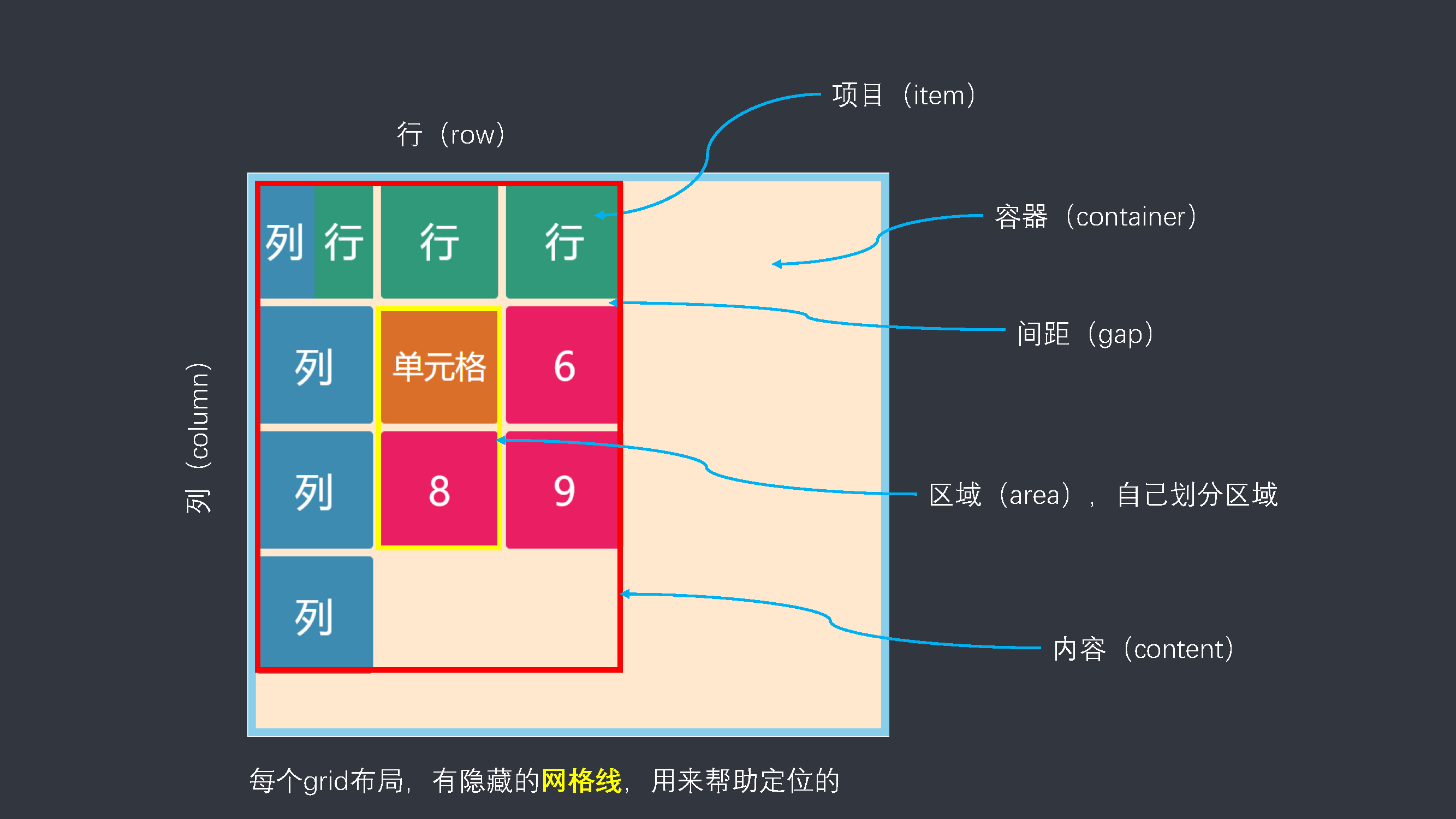
容器的属性
grid-template 相关
grid-template-columns:表示多少列grid-template-rows:表示多少行
你想要多少行或者列,就填写相应属性值的个数,不填写,自动分配。
参考代码
.container {
    display: grid;
    grid-template-columns: 100px 100px 100px;
    grid-template-rows: repeat(4, 100px);
    width: 400px;
    height: 400px;
    border: 0 solid skyblue;
}
.item {
    font-size: 50px;
    background-color: #e91e63;
    color: #fff;
}
.item-1 {
    background-color: #f0332a;
}
.item-2 {
    background-color: #f78e29;
}
.item-3 {
    background-color: #4ea848;
}
.item-4 {
    background-color: #0475c4;
}
.item-5 {
    background-color: #bf76ad;
}
.item-6 {
    background-color: #f5d19e;
}
.item-7 {
    background-color: #b7a57d;
}
.item-8 {
    background-color: #d4e5ad;
}
.item-9 {
    background-color: #51c3e6;
}
<div class="container">
    <div class="item item-1">1</div>
    <div class="item item-2">2</div>
    <div class="item item-3">3</div>
    <div class="item item-4">4</div>
    <div class="item item-5">5</div>
    <div class="item item-6">6</div>
    <div class="item item-7">7</div>
    <div class="item item-8">8</div>
    <div class="item item-9">9</div>
    <div class="item item-10">10</div>
</div>
有时,单元格的大小是固定的,但是容器的大小不确定,auto-fill 属性就会自动填充。
参考代码
.container {
    display: grid;
    grid-template-columns: repeat(auto-fill, 100px);
    grid-template-rows: repeat(4, 100px);
    width: 600px;
    height: 200px;
    border: 0 solid skyblue;
}
.item {
    font-size: 50px;
    background-color: #e91e63;
    color: #fff;
}
.item-1 {
    background-color: #f0332a;
}
.item-2 {
    background-color: #f78e29;
}
.item-3 {
    background-color: #4ea848;
}
.item-4 {
    background-color: #0475c4;
}
.item-5 {
    background-color: #bf76ad;
}
.item-6 {
    background-color: #f5d19e;
}
.item-7 {
    background-color: #b7a57d;
}
.item-8 {
    background-color: #d4e5ad;
}
.item-9 {
    background-color: #51c3e6;
}
<div class="containter">
    <div class="item item-1">1</div>
    <div class="item item-2">2</div>
    <div class="item item-3">3</div>
    <div class="item item-4">4</div>
    <div class="item item-5">5</div>
    <div class="item item-6">6</div>
    <div class="item item-7">7</div>
    <div class="item item-8">8</div>
    <div class="item item-9">9</div>
    <div class="item item-10">10</div>
</div>
有的时候,不能确定每个单元格尺寸,可以使用 fr 单位来指定比例关系。
参考代码
.container {
    display: grid;
    grid-template-columns: repeat(4, 1fr); /* 宽度平均分成四份 */
    grid-template-rows: repeat(4, 100px);
    width: 500px;
    height: 300px;
    border: 0 solid skyblue;
}
.item {
    font-size: 50px;
    background-color: #e91e63;
    color: #fff;
}
.item-1 {
    background-color: #f0332a;
}
.item-2 {
    background-color: #f78e29;
}
.item-3 {
    background-color: #4ea848;
}
.item-4 {
    background-color: #0475c4;
}
.item-5 {
    background-color: #bf76ad;
}
.item-6 {
    background-color: #f5d19e;
}
.item-7 {
    background-color: #b7a57d;
}
.item-8 {
    background-color: #d4e5ad;
}
.item-9 {
    background-color: #51c3e6;
}
<div class="container">
    <div class="item item-1">1</div>
    <div class="item item-2">2</div>
    <div class="item item-3">3</div>
    <div class="item item-4">4</div>
    <div class="item item-5">5</div>
    <div class="item item-6">6</div>
    <div class="item item-7">7</div>
    <div class="item item-8">8</div>
    <div class="item item-9">9</div>
    <div class="item item-10">10</div>
</div>
还可以使用 minmax() 函数,让列宽或者行宽在一个范围内:
参考代码
.container {
    display: grid;
    grid-template-columns: 1fr minmax(150px, 1fr);
    grid-template-rows: repeat(4, 100px);
    width: 250px;
    height: 200px;
    border: 0 solid skyblue;
}
.item {
    font-size: 50px;
    background-color: #e91e63;
    color: #fff;
}
.item-1 {
    background-color: #f0332a;
}
.item-2 {
    background-color: #f78e29;
}
.item-3 {
    background-color: #4ea848;
}
.item-4 {
    background-color: #0475c4;
}
<div class="container">
    <div class="item item-1">1</div>
    <div class="item item-2">2</div>
    <div class="item item-3">3</div>
    <div class="item item-4">4</div>
</div>
或者使用 auto 关键字,表示长度由浏览器决定,自动分配。
参考代码
.container {
    display: grid;
    grid-template-columns: 100px auto 100px;
    grid-template-rows: repeat(4, 100px);
    width: 400px;
    height: 300px;
    border: 0 solid skyblue;
}
.item {
    font-size: 50px;
    background-color: #e91e63;
    color: #fff;
}
.item-1 {
    background-color: #f0332a;
}
.item-2 {
    background-color: #f78e29;
}
.item-3 {
    background-color: #4ea848;
}
.item-4 {
    background-color: #0475c4;
}
.item-5 {
    background-color: #bf76ad;
}
.item-6 {
    background-color: #f5d19e;
}
.item-7 {
    background-color: #b7a57d;
}
.item-8 {
    background-color: #d4e5ad;
}
.item-9 {
    background-color: #51c3e6;
}
<div class="container">
    <div class="item item-1">1</div>
    <div class="item item-2">2</div>
    <div class="item item-3">3</div>
    <div class="item item-4">4</div>
    <div class="item item-5">5</div>
    <div class="item item-6">6</div>
    <div class="item item-7">7</div>
    <div class="item item-8">8</div>
    <div class="item item-9">9</div>
</div>
在定义行列数的同时,还可以用方括号定义网格线,方便后续引用:
.box {
    grid-template-columns: [c1] 100px [c2] 100px [c3] 100px [c4];
}
row-gap 和 column-gap
一句话解释就是,item (项目)相互之间的距离
column-gap 和 row-gap,可以简写为 gap。
参考代码
.container {
    display: grid;
    grid-template-columns: 100px 100px 100px;
    grid-template-rows: repeat(4, 100px);
    column-gap: 20px;
    row-gap: 20px;
    width: 400px;
    height: 340px;
    border: 0 solid skyblue;
}
.item {
    font-size: 50px;
    background-color: #e91e63;
    color: #fff;
}
.item-1 {
    background-color: #f0332a;
}
.item-2 {
    background-color: #f78e29;
}
.item-3 {
    background-color: #4ea848;
}
.item-4 {
    background-color: #0475c4;
}
.item-5 {
    background-color: #bf76ad;
}
.item-6 {
    background-color: #f5d19e;
}
.item-7 {
    background-color: #b7a57d;
}
.item-8 {
    background-color: #d4e5ad;
}
.item-9 {
    background-color: #51c3e6;
}
<div class="container">
    <div class="item item-1">1</div>
    <div class="item item-2">2</div>
    <div class="item item-3">3</div>
    <div class="item item-4">4</div>
    <div class="item item-5">5</div>
    <div class="item item-6">6</div>
    <div class="item item-7">7</div>
    <div class="item item-8">8</div>
    <div class="item item-9">9</div>
</div>
grid-template-areas
一个区域由单个或多个单元格组成,由你决定 (具体使用,需要在项目属性里面设置)。
grid-template-areas: 'a b c'
					 'd e f'
					 'g h i';

grid-template-areas: 'a a a'
					 'b b b'
					 'c c c';

grid-template-areas: 'a . c'
					 'd . f'
					 'g . i';
区域不需要使用,则使用点来表示。
区域的命名会影响到网格线。每个区域的起始网格线会自动命名为区域名-start ,终止网格线自动命名为区域名-end。
参考代码
.container {
    display: grid;
    grid-template-columns: 100px 100px 100px;
    grid-template-rows: repeat(4, 100px);
    grid-template-areas: 'a a b'
					 	 'a a b'
						 'c c c';
    width: 400px;
    height: 340px;
    border: 0 solid skyblue;
}
.item {
    font-size: 50px;
    background-color: #e91e63;
    color: #fff;
}
.item-1 {
    grid-area: a;
    background-color: #f0332a;
}
.item-2 {
    grid-area:b;
    background-color: #f78e29;
}
.item-3 {
    grid-area: c;
    background-color: #4ea848;
}
<div class="container">
    <div class="item item-1">1</div>
    <div class="item item-2">2</div>
    <div class="item item-3">3</div>
</div>
grid-auto-flow
划分网格以后,容器的子元素会按照顺序,自动放置在每一个网格。默认的放置顺序是先行后列,即先填满第一行,再开始放入第二行就是子元素的排放顺序。
grid-auto-flow: row
参考代码
.container {
    display: grid;
    grid-template-columns: 100px 100px 100px;
    grid-template-rows: repeat(4, 100px);
    grid-auto-flow: row; /* 默认值 */
    width: 400px;
    height: 400px;
    border: 0 solid skyblue;
}
.item {
    font-size: 50px;
    background-color: #e91e63;
    color: #fff;
}
.item-1 {
    background-color: #f0332a;
}
.item-2 {
    background-color: #f78e29;
}
.item-3 {
    background-color: #4ea848;
}
.item-4 {
    background-color: #0475c4;
}
.item-5 {
    background-color: #bf76ad;
}
.item-6 {
    background-color: #f5d19e;
}
.item-7 {
    background-color: #b7a57d;
}
.item-8 {
    background-color: #d4e5ad;
}
.item-9 {
    background-color: #51c3e6;
}
<div class="container">
    <div class="item item-1">1</div>
    <div class="item item-2">2</div>
    <div class="item item-3">3</div>
    <div class="item item-4">4</div>
    <div class="item item-5">5</div>
    <div class="item item-6">6</div>
    <div class="item item-7">7</div>
    <div class="item item-8">8</div>
    <div class="item item-9">9</div>
    <div class="item item-10">10</div>
</div>
grid-auto-flow: column
参考代码
.container {
    display: grid;
    grid-template-columns: 100px 100px 100px;
    grid-template-rows: repeat(4, 100px);
    grid-auto-flow: column;
    width: 400px;
    height: 400px;
    border: 0 solid skyblue;
}
.item {
    font-size: 50px;
    background-color: #e91e63;
    color: #fff;
}
.item-1 {
    background-color: #f0332a;
}
.item-2 {
    background-color: #f78e29;
}
.item-3 {
    background-color: #4ea848;
}
.item-4 {
    background-color: #0475c4;
}
.item-5 {
    background-color: #bf76ad;
}
.item-6 {
    background-color: #f5d19e;
}
.item-7 {
    background-color: #b7a57d;
}
.item-8 {
    background-color: #d4e5ad;
}
.item-9 {
    background-color: #51c3e6;
}
<div class="container">
    <div class="item item-1">1</div>
    <div class="item item-2">2</div>
    <div class="item item-3">3</div>
    <div class="item item-4">4</div>
    <div class="item item-5">5</div>
    <div class="item item-6">6</div>
    <div class="item item-7">7</div>
    <div class="item item-8">8</div>
    <div class="item item-9">9</div>
    <div class="item item-10">10</div>
</div>
还可以使用
dense关键字让元素尽可能密集排列。
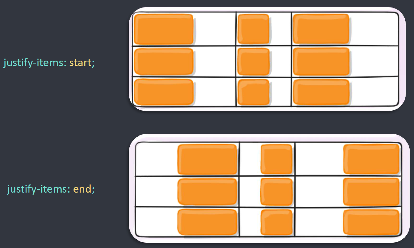
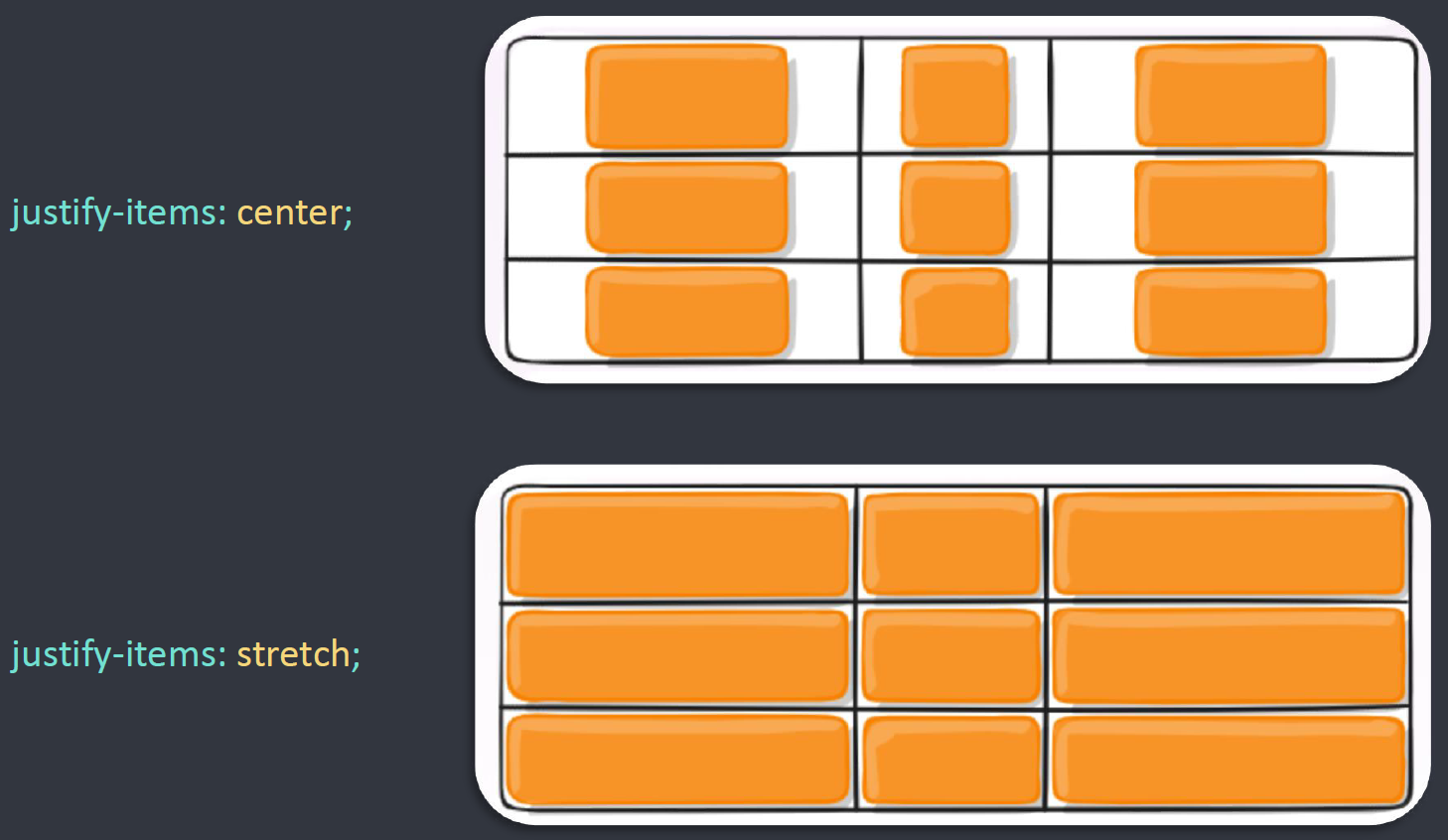
justify-items
设置单元格内容的水平对齐方式。
.box {
    justify-items: start | end | center | stretch;
}
align-items
设置单元格内容的垂直对齐方式。
.box {
    align-items: start | end | center | stretch
}
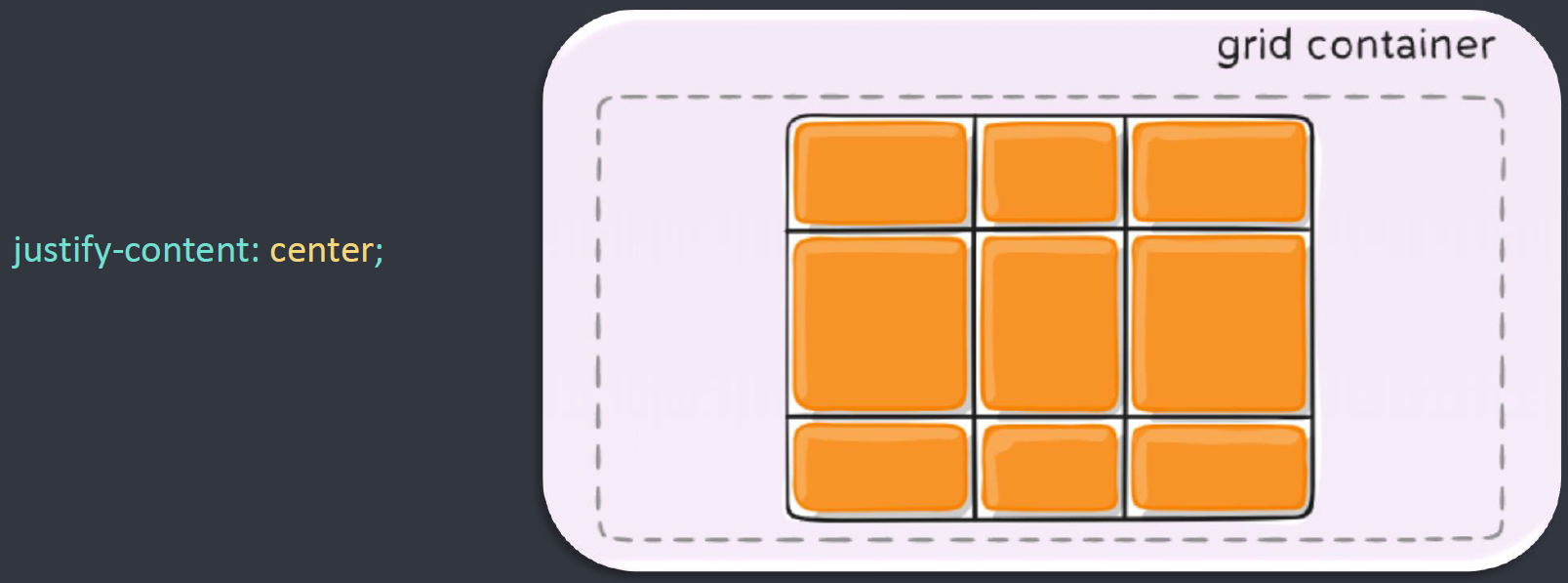
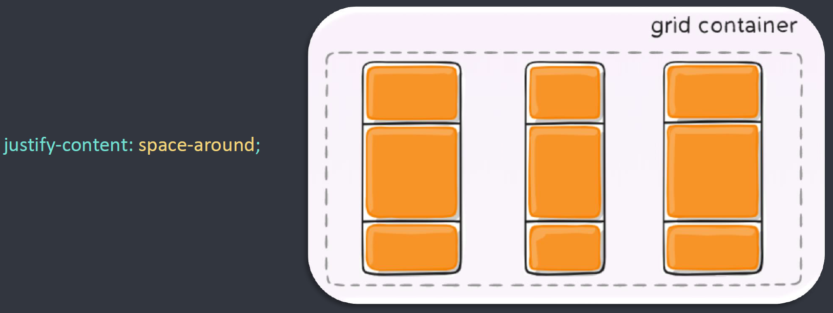
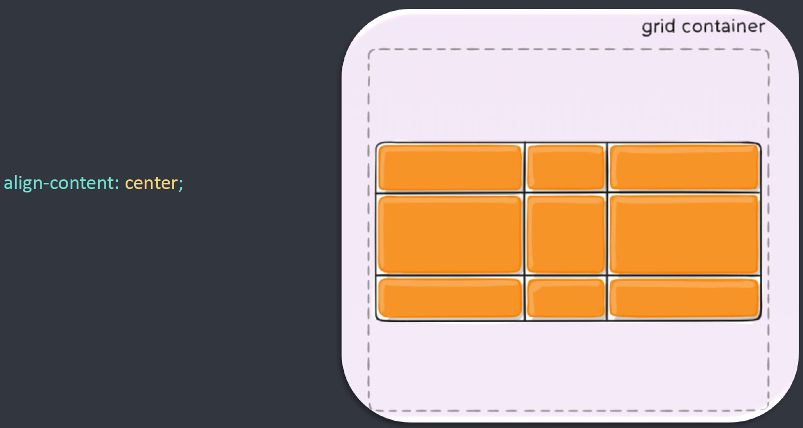
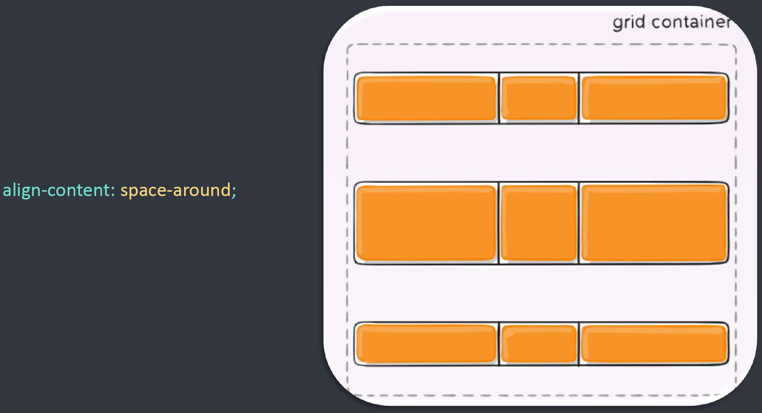
justify-content 和 align-content
设置整个内容区域的水平和垂直的对齐方式
.box {
    justify-content: start | end | center | stretch | space-around | space-between | space-evenly;
    align-content: start | end | center | stretch | space-around | space-between | space-evenly;
}
项目的属性
网格线定位
指定该项目由哪 4 根网格线包围。
grid-column-startgrid-column-endgrid-row-startgrid-row-end
可以使用简写形式 grid-column 和 grid-row
grid-column: start / endgrid-row: start / end
start和end之间必须有空格。
grid-area
指定该项目是容器属性中定义的哪个区域
grid-template-areas: 'a b c'
					 'd e f'
					 'g h i';
grid-area: b;
grid-area 属性还可用作 grid-row-start、grid-column-start、grid-row-end、grid-column-end 的合并简写形式,直接指定项目的位置。
grid-area: <row-start> / <column-start> / <row-end> / <column-end>;
justify-self 和 align-self
justify-self属性设置单元格内容的水平位置(左中右),跟justify-items属性的用法完全一致,但只作用于单个项目 (水平方向)cssjustify-self: start | end | center | stretch;align-self属性设置单元格内容的垂直位置(上中下),跟align-items属性的用法完全一致,也是只作用于单个项目 (垂直方向)cssalign-self: start | end | center | stretch;